
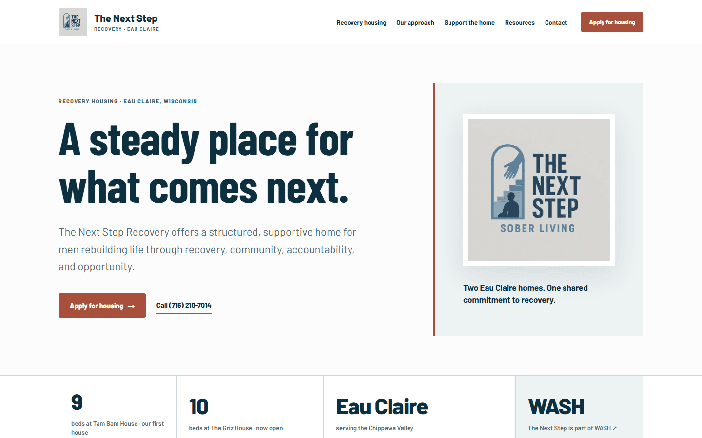
A website for a recovery home has a practical job: help someone understand the home, find the information they need, and start a conversation. That shaped our work with The Next Step Recovery in Eau Claire, Wisconsin.
The project brings together a rebuilt website and a launch kit the organization can keep using. The aim is a clear, recognizable public presence that carries through from the first website visit to the next social post.
Make the first step easier to find
The original homepage opened with a broad message about finding strength together. In the rebuilt homepage, the location and recovery-housing purpose appear before the main heading. An application button and a phone link sit beside the introduction, so someone looking for housing can choose a direct next step.
The navigation gives housing, the organization's approach, community support, resources, and contact details their own places. The homepage also separates three reasons to visit: looking for housing, supporting someone, or helping the home. Each leads to the relevant information instead of asking every visitor to follow the same path.
Keep the identity that already belongs to the organization
The Next Step's supplied logo is central to the design. We carried it into the header, homepage, and supporting launch materials, with deep blue text, warm light backgrounds, and a restrained rust accent around key actions.
The website preserves the organization's own story and uses supplied photographs where their context is known. That matters: a community outing should read as a community outing, and a namesake photograph should stay connected to its story. Clear context is part of making a website trustworthy.
Compare the work on a phone, too
A desktop comparison shows the change in emphasis: a clearer introduction, a more visible identity, and direct access to applying or calling. The mobile comparison shows those same priorities carried into a narrower screen, with readable text and a menu that leaves room for the organization name.
The full case study includes the original and rebuilt homepage captures from September 4, 2026. They document the website work at that point in the project; they are not a claim about housing placements or other measured business results.
Give the client something useful after the build
The handover includes a brand guide, original brand assets, social graphics in feed and story sizes, ready-to-adapt announcements, and before-and-after comparisons. A launch guide explains which materials to use and how to check the website links before sharing an announcement.
The brand guide gives future freelancers a common starting point. Share it with the approved logo files, explain the audience and purpose of the job, and ask for work that follows the colors, typography, logo treatment, and voice. Request editable source files along with the finished exports so the organization can keep using the work.
It can also give an AI writing or design assistant useful business context. Upload the guide if the tool supports files, or paste the relevant sections, then describe the specific task and audience. Ask it to use only the supplied business facts, flag missing information, and produce a draft for a person to review. Keep resident details, applications, passwords, and private communications out of that public brand material.
A website the organization can carry forward
The most useful handover makes the next task easier: sharing the website, briefing a designer, writing an announcement, or asking for an update. This project gives The Next Step Recovery a consistent starting point for all of those jobs.
You can find the organization at The Next Step Recovery's website. For the documented design work and both screen-size comparisons, see the case study.